


In our UI setup, the card is the most essential UI element in any dashboard. You can see it here with its complete API and examples.
Within a card, we will need to use this component first.
The only thing new we actually give time to implement is Ivy, which comes with three superpowers.
Higher order and dynamic components can come with in-built state and reactivity.
There are now features for both selective prerendering and classical server side rendering.
You can now now have strong type checking in components and elsewhere in your code seamlessly.
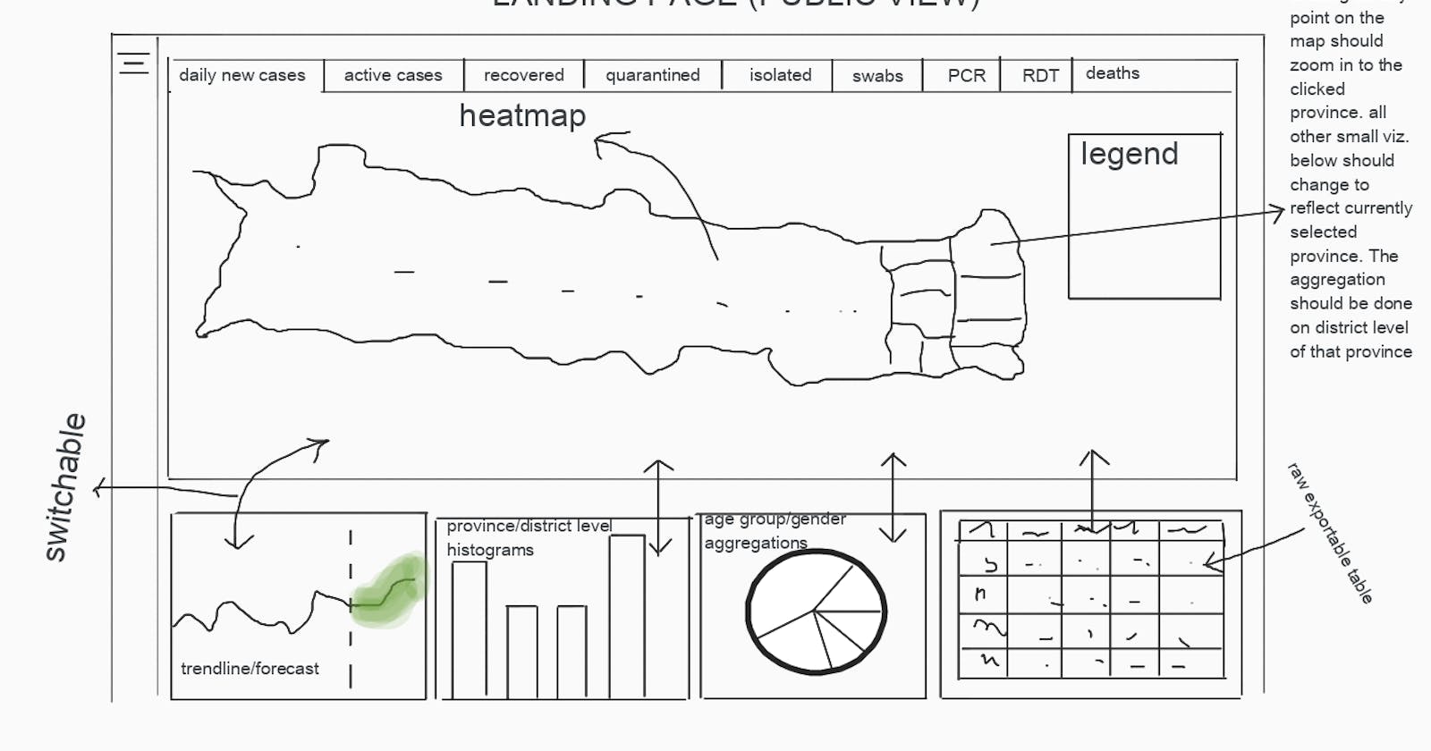
For a landing page, you may also have to think about the sidebar and the top navbar of the page. What actions, icons and buttons will they have?
We go for a burger sidebar and a dropdown navbar menu in our dashboard, as far as the default layout settings are concerned. This layout also adapts to change to narrower or wider screens.
For the login related actions, we give them a user icon on the top-right, as is usual in most of the popular sites they may be using. This has a green or orange or red orb as is seen in Google's Material Design. The red color implies no sync or paused sync, orange implies partial or ongoing sync and green implies complete and ongoing sync.
Admins can 'login' as other users without needing to put that user's password. In this case they can see the dashboard the same way the non-admin person (that s/he might be talking to) is seeing.
How can the admin or any admin-like user know which role he is viewing the dashboard as (individual, organizational member, organizational authority, organizational leader)?
We provide a different icon and a lcon-professional title table for every available icon. These icons will be contributed by various artists with access to assets folder.
And similarly, how can I know if my local application is in sync with the server i.e. are all the maps and stats loaded and cached in the user's browser and user's RAM?
This is a problem that the auth icon and orb on the top right of the navbar already solves. We propose that it also add an outer ring to the inner orb which shows the sync status of the currently loaded component's inputs and outputs.
You need to think of creative icons, colors, shadows and other ways to minimally visualize these kinds of state and data related meta data.
It's a good exercise for anyone trying to think about UI/X with a fresh mind as great things come out of the fresh mind's perspective e.g. Nash equilibrium from the mathematician freshly learning econonmics - John Nash.